Cinebur, the most fun and meticulous project
Designing Cinebur's brand identity has been one of the most creative and inspiring projects I've ever been involved in. We started with a blank canvas where absolutely anything was allowed as long as it was related to cinema.
The logo
For the logo design we conducted an extensive brainstorming phase, where we explored iconic scenes, abstract concepts, cinematic artifacts... And we ended up with one of my favorite logos: two hands picking the frame to film a rocket crashing into the moon. It is, on the one hand, a tribute to the history of cinema; on the other hand, a reflection of the artistic and creative process that precedes films. And finally, the original variation of yellow, pink and green colors that it includes, together with the fresh drawing style, bring the logo to the present and make it impossible to go unnoticed.
The brandguide
After choosing the final logo, we proceeded to complete the brand identity with a brand guide that defined the logo variations and related assets: patterns that only used the hands, the moon alone, more and less detailed versions to apply in different scales, icons... It also provides guidelines for how to use the logo and other brand assets. The brand guide will help to ensure that Cinebur's brand identity is used consistently across all of its marketing materials.
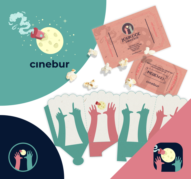
Brand materials
We worked with different digital file formats to generate videos and animations, as well as with designs for merchandising such as movie tickets or popcorn buckets for the cinema.
Overall brand image
The total process was long and meticulous. Despite the lighthearted spirit of the project, it was worth thoroughly exploring the different options for each element. The overall result is a versatile, fun brand identity where no detail is left to chance. It is designed to last and conveys Cinebur's personality: a close, accessible, optimistic and dreamy company.
Back to my work